
Travel Assured#
Introduction#
Travel Assured is a travel insurance company. Due to the COVID pandemic they have had to cut their marketing budget by over 50%. It is more important than ever that they advertise in the right places and to the right people.
Travel Assured has data on their current customers as well as people who got quotes but never bought insurance. They want to know if there are differences in the travel habits between customers and non-customers - they believe they are more likely to travel often (buying tickets from frequent flyer miles) and travel abroad.
The Data#
age: Numeric, the customer’s ageEmployment Type: Character, the sector of employmentGraduateOrNot: Character, whether the customer is a college graduateAnnualIncome: Numeric, the customer’s yearly incomeFamilyMembers: Numeric, the number of family members living with the customerChronicDiseases: Numeric, whether the customer has any chronic conditionsFrequentFlyer: Character, whether a customer books frequent ticketsEverTravelledAbroad: Character, has the customer ever travelled abroadTravelInsurance: Numeric, whether the customer bought travel insurance
Import Libraries#
Let us set up all the objects (packages, and modules) that we will need to explore the dataset.
# Import necessary modules
import numpy as np
import pandas as pd
%matplotlib inline
import matplotlib.pyplot as plt
import seaborn as sns
plt.style.use('ggplot')
Load the Data#
# Read file
df = pd.read_csv('data/travel_insurance.csv')

# Split the data in two subgroups, to compare data with/without Travel Insurance
insured_df = df[df['TravelInsurance'] == 1]
uninsured_df = df[df['TravelInsurance'] == 0]
df.head()
| Age | Employment Type | GraduateOrNot | AnnualIncome | FamilyMembers | ChronicDiseases | FrequentFlyer | EverTravelledAbroad | TravelInsurance | |
|---|---|---|---|---|---|---|---|---|---|
| 0 | 31 | Government Sector | Yes | 400000 | 6 | 1 | No | No | 0 |
| 1 | 31 | Private Sector/Self Employed | Yes | 1250000 | 7 | 0 | No | No | 0 |
| 2 | 34 | Private Sector/Self Employed | Yes | 500000 | 4 | 1 | No | No | 1 |
| 3 | 28 | Private Sector/Self Employed | Yes | 700000 | 3 | 1 | No | No | 0 |
| 4 | 28 | Private Sector/Self Employed | Yes | 700000 | 8 | 1 | Yes | No | 0 |
Data Size and Structure#
Dataset comprises of 1987 observations and 9 columns.
8 independent variables:
Age,Employement Type,GraduateOrNot,AnnualIncome,FamilyMembers,ChronicDiseases,FrequentFlyer,EverTravelledAbroad3 numerical features, 5 categorical features
1 dependent variable:
TravelInsuranceComplete dataset with no missing/null values.
# Check the size and datatypes of the DataFrame
print(f"Shape: {df.shape}")
print('\n')
print(df.info())
Shape: (1987, 9)


<class 'pandas.core.frame.DataFrame'>
RangeIndex: 1987 entries, 0 to 1986
Data columns (total 9 columns):
 #   Column               Non-Null Count  Dtype
---  ------               --------------  -----
 0   Age                  1987 non-null   int64
 1   Employment Type      1987 non-null   object
 2   GraduateOrNot        1987 non-null   object
 3   AnnualIncome         1987 non-null   int64
 4   FamilyMembers        1987 non-null   int64
 5   ChronicDiseases      1987 non-null   int64
 6   FrequentFlyer        1987 non-null   object
 7   EverTravelledAbroad  1987 non-null   object
 8   TravelInsurance      1987 non-null   int64
dtypes: int64(5), object(4)
memory usage: 139.8+ KB
None
# For all categorical data columns
# Print categories and the number of times they appear
# ChornicDiseases and TravelInsurance at categorical because 1 and 0 represent yes and no
CAT_COLS = ['Employment Type', 'GraduateOrNot', "ChronicDiseases", "FrequentFlyer", "EverTravelledAbroad", "TravelInsurance"]

for col in df[CAT_COLS]:
    print(df[col].value_counts())
    print('\n')
Employment Type
Private Sector/Self Employed    1417
Government Sector                570
Name: count, dtype: int64


GraduateOrNot
Yes    1692
No      295
Name: count, dtype: int64


ChronicDiseases
0    1435
1     552
Name: count, dtype: int64


FrequentFlyer
No     1570
Yes     417
Name: count, dtype: int64


EverTravelledAbroad
No     1607
Yes     380
Name: count, dtype: int64


TravelInsurance
0    1277
1     710
Name: count, dtype: int64
df.describe()
| Age | AnnualIncome | FamilyMembers | ChronicDiseases | TravelInsurance | |
|---|---|---|---|---|---|
| count | 1987.000000 | 1.987000e+03 | 1987.000000 | 1987.000000 | 1987.000000 |
| mean | 29.650226 | 9.327630e+05 | 4.752894 | 0.277806 | 0.357323 |
| std | 2.913308 | 3.768557e+05 | 1.609650 | 0.448030 | 0.479332 |
| min | 25.000000 | 3.000000e+05 | 2.000000 | 0.000000 | 0.000000 |
| 25% | 28.000000 | 6.000000e+05 | 4.000000 | 0.000000 | 0.000000 |
| 50% | 29.000000 | 9.000000e+05 | 5.000000 | 0.000000 | 0.000000 |
| 75% | 32.000000 | 1.250000e+06 | 6.000000 | 1.000000 | 1.000000 |
| max | 35.000000 | 1.800000e+06 | 9.000000 | 1.000000 | 1.000000 |
# Percentage of dataset is null
df.isnull().sum() / len(df) * 100
Age                    0.0
Employment Type        0.0
GraduateOrNot          0.0
AnnualIncome           0.0
FamilyMembers          0.0
ChronicDiseases        0.0
FrequentFlyer          0.0
EverTravelledAbroad    0.0
TravelInsurance        0.0
dtype: float64
insured_df.value_counts('EverTravelledAbroad')
EverTravelledAbroad
No     412
Yes    298
Name: count, dtype: int64
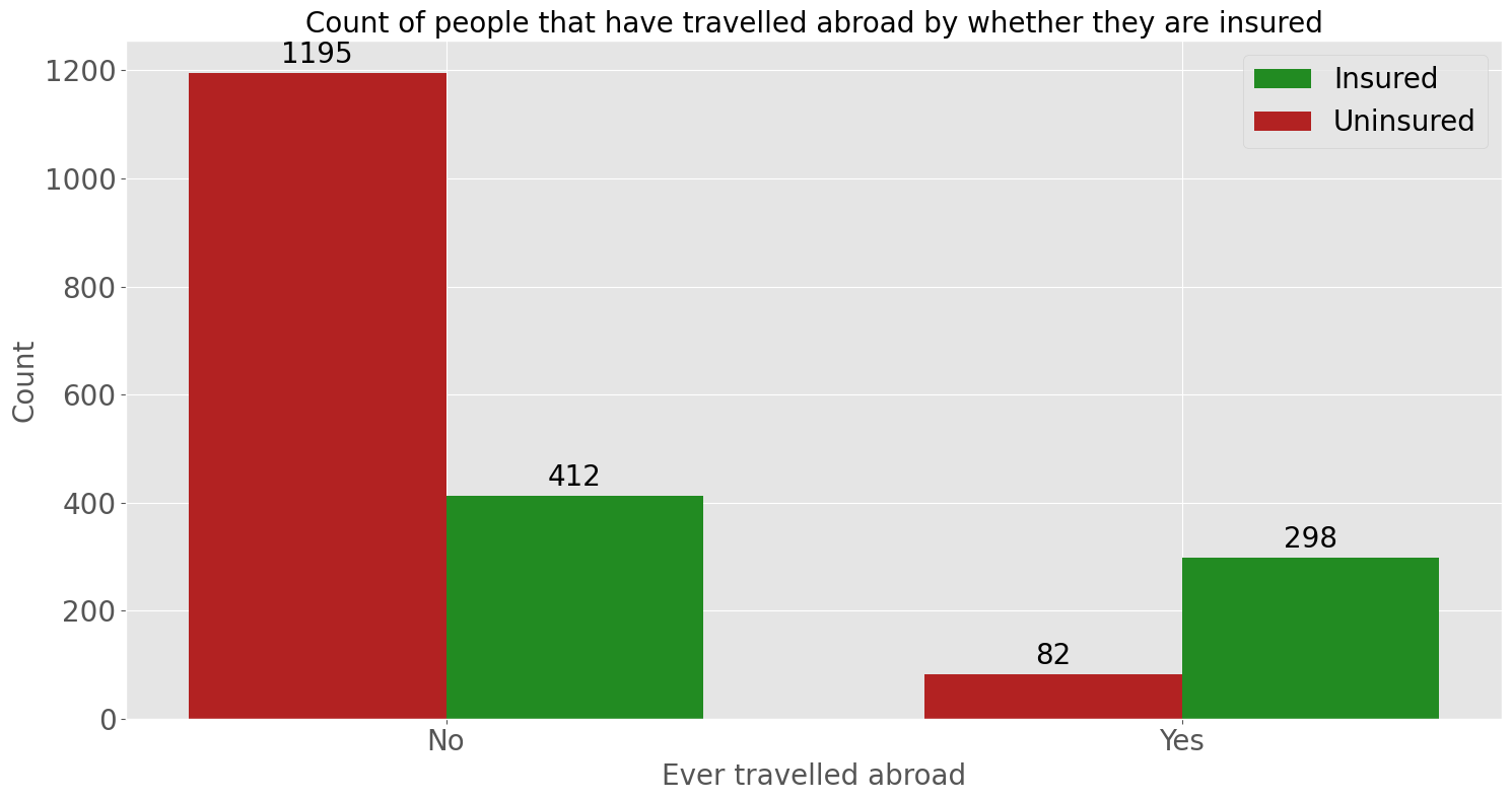
What are the travel habits of the insured and uninsured?#
Now let’s first look at the how many people have travel insurance and their travel habits.
LABELS = ['No', 'Yes']
EMPLOYMENT_LABELS = ['Private Sector/Self Employed', 'Government Sector']

def label_fontsize(fontsize):
    for item in ([ax.title, ax.xaxis.label, ax.yaxis.label] + ax.get_xticklabels() + ax.get_yticklabels()):
        item.set_fontsize(fontsize)
insured_travelled = insured_df.value_counts('EverTravelledAbroad').values
uninsured_travelled = uninsured_df.value_counts('EverTravelledAbroad').values

x = np.arange(len(LABELS))  # the label locations
width = 0.35  # the width of the bars

fig, ax = plt.subplots(figsize=(15, 8))
rects1 = ax.bar(x + width/2, insured_travelled, width, label='Insured', color='forestgreen')
rects2 = ax.bar(x - width/2, uninsured_travelled, width, label='Uninsured', color='firebrick')

# Add some text for labels, title and custom x-axis tick labels, etc.
ax.set_xlabel('Ever travelled abroad')
ax.set_ylabel('Count')
ax.set_title('Count of people that have travelled abroad by whether they are insured')
ax.set_xticks(x)
ax.set_xticklabels(LABELS)
ax.legend(prop={'size': 20})

ax.bar_label(rects1, padding=3, fontsize=20)
ax.bar_label(rects2, padding=3, fontsize=20)

label_fontsize(20)

fig.tight_layout()
plt.show()
insured_freqfly = insured_df.value_counts('FrequentFlyer').values
uninsured_freqfly = uninsured_df.value_counts('FrequentFlyer').values

x = np.arange(len(LABELS))  # the label locations
width = 0.35  # the width of the bars

fig, ax = plt.subplots(figsize=(15, 8))
rects1 = ax.bar(x + width/2, insured_freqfly, width, label='Insured', color='forestgreen')
rects2 = ax.bar(x - width/2, uninsured_freqfly, width, label='Uninsured', color='firebrick')

# Add some text for labels, title and custom x-axis tick labels, etc.
ax.set_xlabel('Frequent Flyer')
ax.set_ylabel('Count')
ax.set_title('Count of people that are frequent flyers by whether they are insured')
ax.set_xticks(x)
ax.set_xticklabels(LABELS)
ax.legend(prop={'size': 20})

ax.bar_label(rects1, padding=3, fontsize=20)
ax.bar_label(rects2, padding=3, fontsize=20)

label_fontsize(20)

fig.tight_layout()
plt.show()
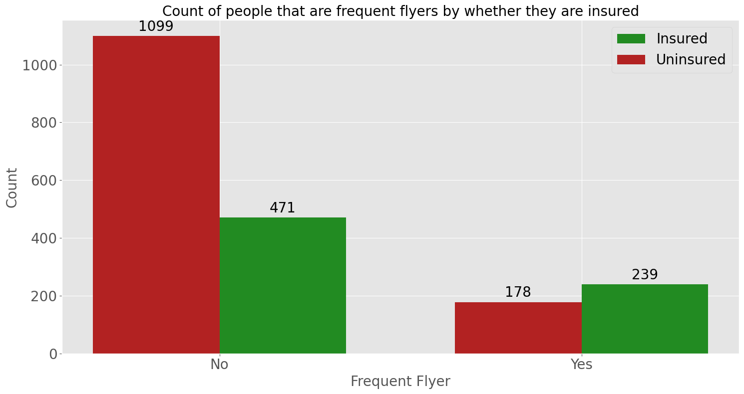
The countplot shows that a large proportion of people that have never travelled abroad are uninsured. However for those that have, a significant proportion have gotten travel insurance. This pattern is also seen for people that aren’t/are frequent flyers. Indicating that people that have travelled abroad or are frequent flyers are more likely to get travel insurance.
Other demographic information#
Now that we have an understanding of their travel habits, let’s explore other demographic information.
insured_chronic = insured_df.value_counts('ChronicDiseases').values
uninsured_chronic = uninsured_df.value_counts('ChronicDiseases').values

x = np.arange(len(LABELS))  # the label locations
width = 0.35  # the width of the bars

fig, ax = plt.subplots(figsize=(15, 8))
rects1 = ax.bar(x + width/2, insured_chronic, width, label='Insured', color='forestgreen')
rects2 = ax.bar(x - width/2, uninsured_chronic, width, label='Uninsured', color='firebrick')

# Add some text for labels, title and custom x-axis tick labels, etc.
ax.set_xlabel('Has a chronic disease')
ax.set_ylabel('Count')
ax.set_title('Count of people that have a chronic disease by whether they are insured')
ax.set_xticks(x)
ax.set_xticklabels(LABELS)
ax.legend(prop={'size': 20})
ax.bar_label(rects1, padding=3, fontsize=20)
ax.bar_label(rects2, padding=3, fontsize=20)
label_fontsize(20)

fig.tight_layout()
plt.show()
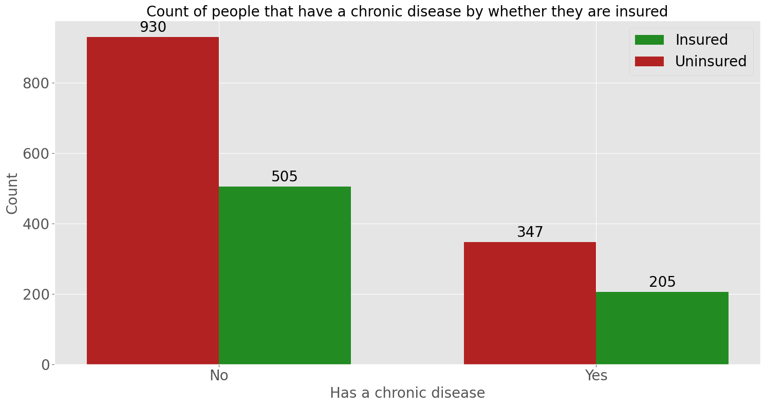
This countplot shows that between people who do and don’t have a chronic disease, most do not have travel insurance.
fig, ax = plt.subplots(figsize=(15, 8))
ax = sns.countplot(x="FamilyMembers", data=df, hue="TravelInsurance", palette=["red", "green"])
ax.set_xlabel('Number of family members')
ax.set_title('Frequency of family size by whether they are insured')
ax.legend(title="Insured", labels=LABELS, fontsize=20, title_fontsize=20)
label_fontsize(20)
fig.tight_layout()
plt.show()
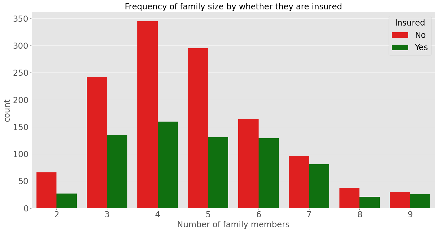
In this countplot fort each family size there are more people uninsured than insured. However the gap between the two counts seem to decrease as the family size increases. Let’s look at this closer using proportions.
insured_fam_prop = insured_df.value_counts('FamilyMembers') / df.value_counts('FamilyMembers')

fig, ax = plt.subplots(figsize=(15, 8))
ax.bar(insured_fam_prop.index, insured_fam_prop, color='royalblue')

ax.set_xlabel('Number of family members')
ax.set_ylabel('Proportion insured')
ax.set_title('Proportion of the insured by family size')
label_fontsize(20)
fig.tight_layout()
plt.show()
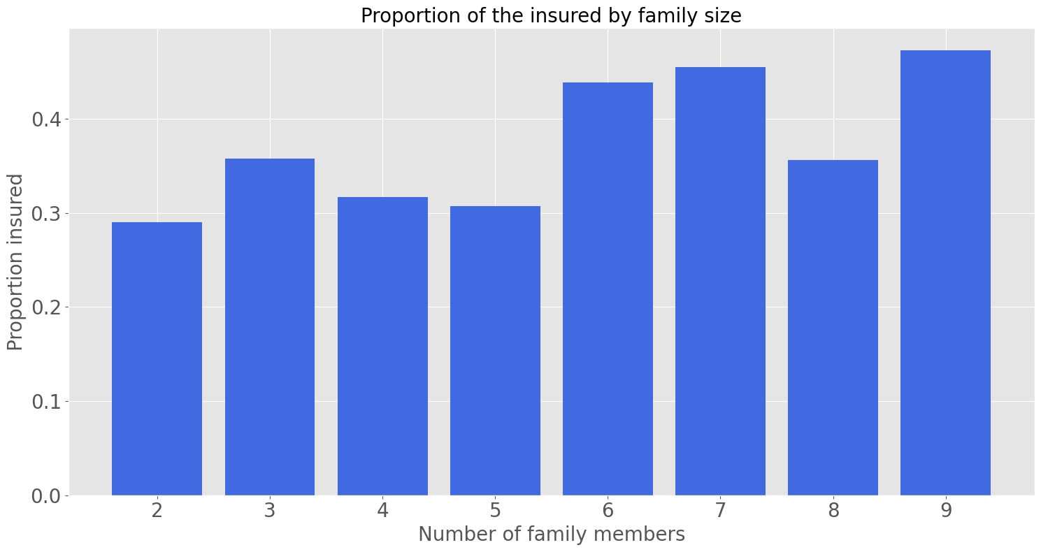
This bar chart shows the proportion of people insured for each family size. The proportion does increase as the family size increases, however the margin does not increase significantly. Further exploration may be needed to identify whether this increase is statistically significant.
fig, ax = plt.subplots(figsize=[16,7])

# plot histogram comparing the density distribution of the Annual Income in each groups
_ = plt.hist(insured_df['AnnualIncome'],
             histtype='step',
             hatch='/',
             density=True,
             color='green',
             bins=10,
             linestyle='--',
             linewidth=2,
            )
_ = plt.hist(uninsured_df['AnnualIncome'],
             density=True,
             color='red',
             bins=10,
            )

# put a title, label the axes, define the legend and display
_ = plt.suptitle("PDF of Annual Income by whether they are insured",
                 fontsize=20,
                 color='black',
                 x=0.52,
                 y=0.92,
                )
_ = plt.xlabel('Annual Income')
_ = plt.ylabel('Probability Density Function (PDF)')
_ = plt.legend(['Insured', 'Uninsured'])
_ = plt.ticklabel_format(axis="x", style="plain")
_ = plt.ticklabel_format(axis="y", style="plain")
plt.show()
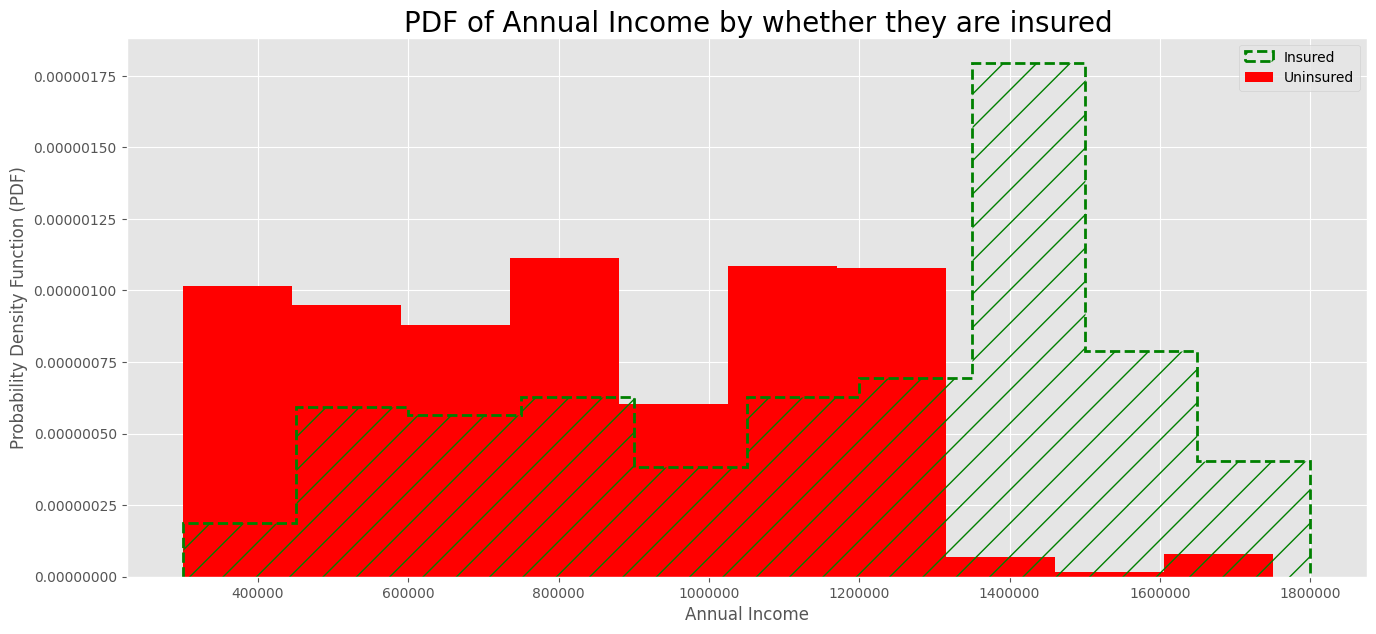
The PDF of the insured group is further to the right than the PDF of the uninsured group, meaning that the people with higher incomes are more likely to get travel insurance. This is expected because people with higher incomes are more able to afford insurance.
But histograms are affected by a binning bias (i.e. the visualization depends on the number of bins chosen). In this case, the histogram has only 10 bins to make it easier to understand.
insured_grad = insured_df.value_counts('GraduateOrNot').values
uninsured_grad = uninsured_df.value_counts('GraduateOrNot').values

x = np.arange(len(LABELS))  # the label locations
width = 0.35  # the width of the bars

fig, ax = plt.subplots(figsize=(15, 8))
rects1 = ax.bar(x + width/2, insured_grad, width, label='Insured', color='forestgreen')
rects2 = ax.bar(x - width/2, uninsured_grad, width, label='Uninsured', color='firebrick')

# Add some text for labels, title and custom x-axis tick labels, etc.
ax.set_xlabel('College Graduate')
ax.set_ylabel('Count')
ax.set_title('Count of people that are college graduates by whether they are insured')
ax.set_xticks(x)
ax.set_xticklabels(LABELS)
ax.legend(prop={'size': 20})

ax.bar_label(rects1, padding=3, fontsize=20)
ax.bar_label(rects2, padding=3, fontsize=20)

label_fontsize(20)

fig.tight_layout()
plt.show()
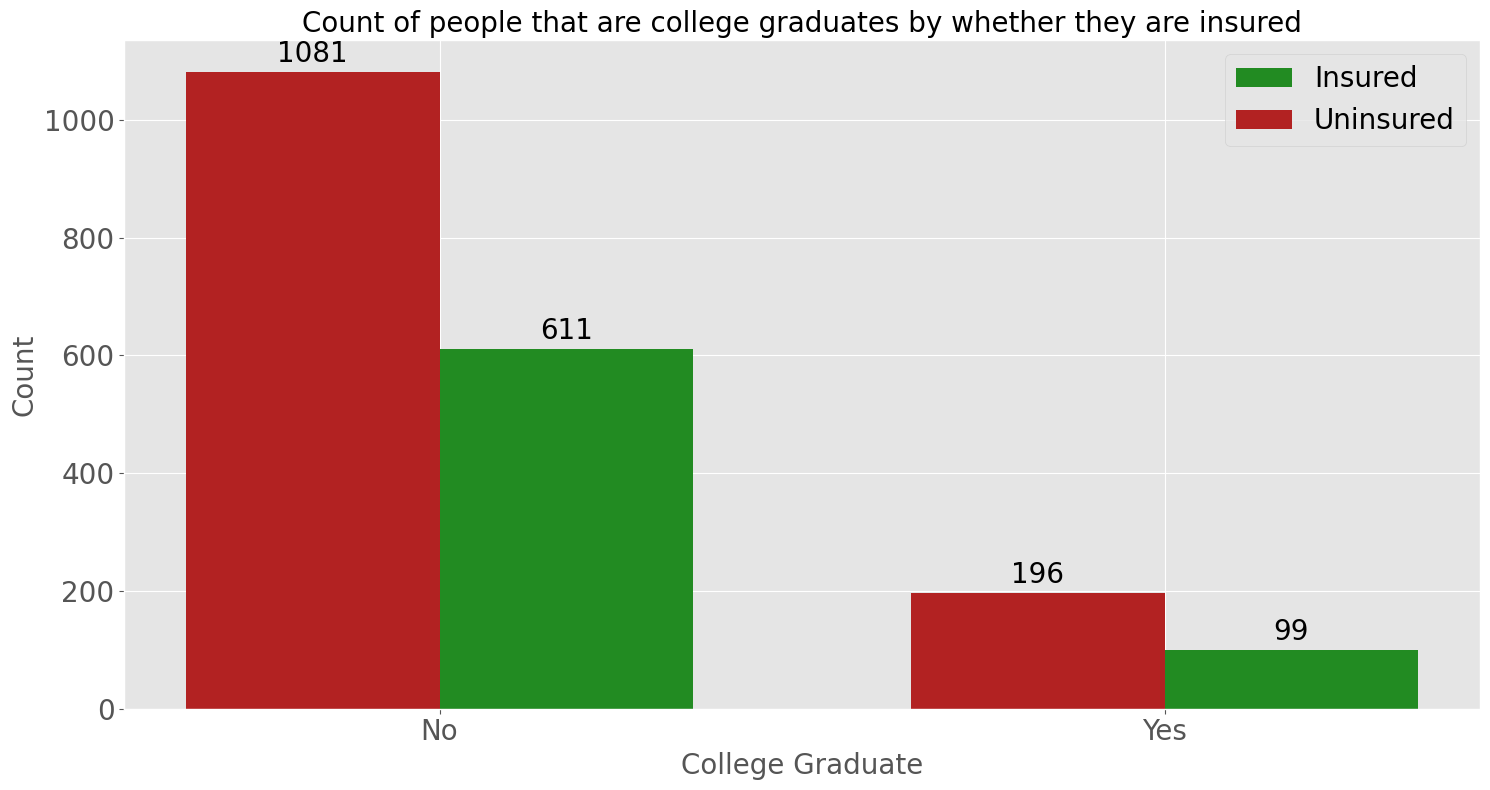
This countplot shows that between people who are and aren’t have a college graduate, most do not have travel insurance.
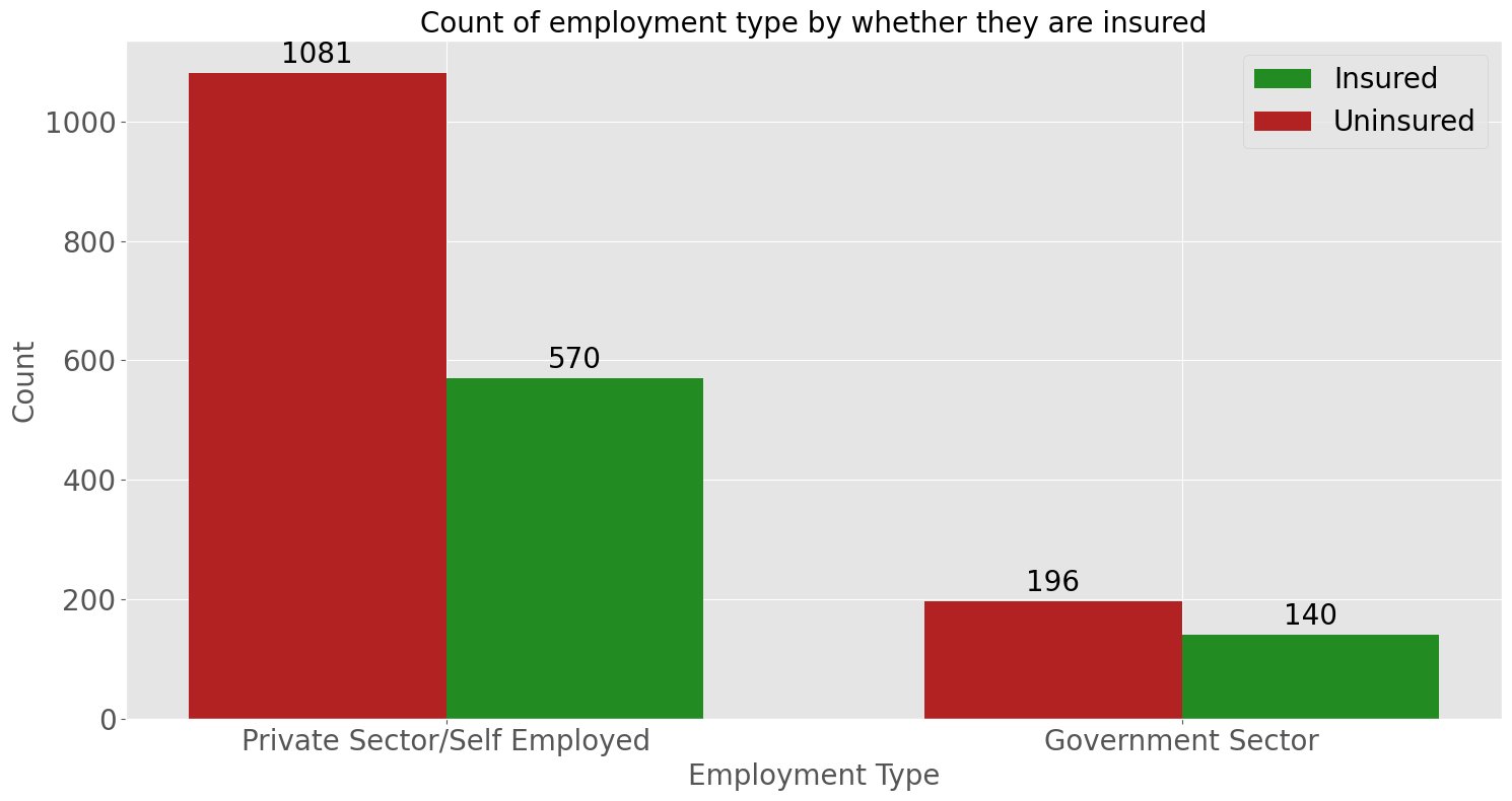
insured_employ_type = insured_df.value_counts('Employment Type').values
uninsured_employ_type = uninsured_df.value_counts('GraduateOrNot').values

x = np.arange(len(EMPLOYMENT_LABELS))  # the label locations
width = 0.35  # the width of the bars

fig, ax = plt.subplots(figsize=(15, 8))
rects1 = ax.bar(x + width/2, insured_employ_type, width, label='Insured', color='forestgreen')
rects2 = ax.bar(x - width/2, uninsured_employ_type, width, label='Uninsured', color='firebrick')

# Add some text for labels, title and custom x-axis tick labels, etc.
ax.set_xlabel('Employment Type')
ax.set_ylabel('Count')
ax.set_title('Count of employment type by whether they are insured')
ax.set_xticks(x)
ax.set_xticklabels(EMPLOYMENT_LABELS)
ax.legend(prop={'size': 20})

ax.bar_label(rects1, padding=3, fontsize=20)
ax.bar_label(rects2, padding=3, fontsize=20)

label_fontsize(20)

fig.tight_layout()
plt.show()
fig, ax = plt.subplots(figsize=[16,7])

# plot histogram comparing the density distribution of the Annual Income in each groups
_ = plt.hist(insured_df['Age'],
             histtype='step',
             hatch='/',
             density=True,
             color='green',
             bins=10,
             linestyle='--',
             linewidth=2,
            )
_ = plt.hist(uninsured_df['Age'],
             density=True,
             color='red',
             bins=10,
            )

# put a title, label the axes, define the legend and display
_ = plt.suptitle("PDF of Age by whether they are insured",
                 fontsize=20,
                 color='black',
                 x=0.52,
                 y=0.92,
                )
_ = plt.xlabel('Age')
_ = plt.ylabel('Probability Density Function (PDF)')
_ = plt.legend(['Insured', 'Uninsured'])
_ = plt.ticklabel_format(axis="x", style="plain")
_ = plt.ticklabel_format(axis="y", style="plain")
plt.show()
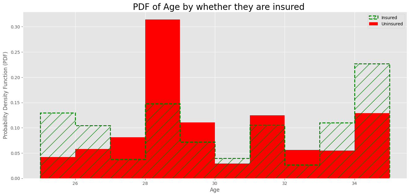
The PDF of the insured group is similar to the PDF of the uninsured group, it is unclear whether there are ages where will more likely to get travel insurance. The ages span from 25 to 35.